Color Mixing Guide: How to Mix Paint Colors for Stunning Results
Understanding how to mix paint colors opens up an entire world of creativity. Whether you’re refreshing furniture with Real Milk Paint®, restoring a vintage piece, or experimenting with finishes for a larger project, color mixing helps you achieve the exact tone, depth, and mood you want.
With just a few base colors, you can create hundreds of custom shades, tints, and tones that feel intentional and beautifully balanced.
This guide walks you through the essentials:
- how colors work,
- how to mix them effectively,
- and how to avoid common mistakes.
You’ll also learn how to use RMP Finishes’ color mixing chart and how our milk paint blends differ from traditional mediums like oil paint.
Why Color Mixing Matters in Painting
Mixing your own paint colors gives you control over:
- Hue – the actual color you’re creating
- Value – how light or dark the color appears
- Saturation – how vibrant or muted it looks
- Temperature – warm vs. cool undertones
With these four elements, you can match existing finishes, coordinate multi-piece furniture sets, or create your own signature palette. Milk paint’s naturally matte texture and mineral pigments make custom mixes especially beautiful for:
- Furniture and cabinet refinishing
- Vintage and farmhouse reproduction
- Decorative accents and interior pieces
- Wall finishes and architectural details
- Artistic experimentation
The Basics of the Color Wheel
A quick refresher ensures you’ll get consistent results.

Primary Colors
Red, Yellow, Blue
→ These cannot be mixed from other colors.
Secondary Colors
Created by mixing two primaries:
- Red + Blue = Purple
- Blue + Yellow = Green
- Yellow + Red = Orange
Tertiary Colors
A primary mixed with a neighboring secondary
Examples:
- Yellow-green
- Blue-green
- Red-orange
Warm vs. Cool Colors
- Warm: reds, oranges, yellow-based tones
- Cool: blues, greens, purple-based tones
Understanding temperature prevents the most common mistake: accidentally creating muted or “dirty” colors when warm and cool undertones clash.
Warm colors generally evoke an energetic and bold feeling, while cool colors convey a sense of calm and balance. When mixing milk paint, paying attention to temperature helps you avoid unwanted undertones.
How to Mix Paint Colors Step by Step
Real Milk Paint powders give you enormous flexibility, but the key to success is understanding ratios.

Oil Paint Color Mixing Guide (For Artists & Fine-Finish Work)
While Real Milk Paint is ideal for furniture and home projects, many artists also work in oils. Here’s how oil mixing differs:
Unique Properties
- Slow drying allows extended blending time
- Colors can be mixed on the palette or directly on the surface
- Oils maintain saturation more than milk paint
Oil Blending Tips
- Use a palette knife for consistent color
- Start with small ratios—oil pigment is intense
- Keep whites and yellows clean to avoid muddiness
Avoid These Mistakes
- Using too much solvent, which can dull the color
- Contaminating colors by not wiping tools between mixes
- Overmixing, flattening the vibrancy
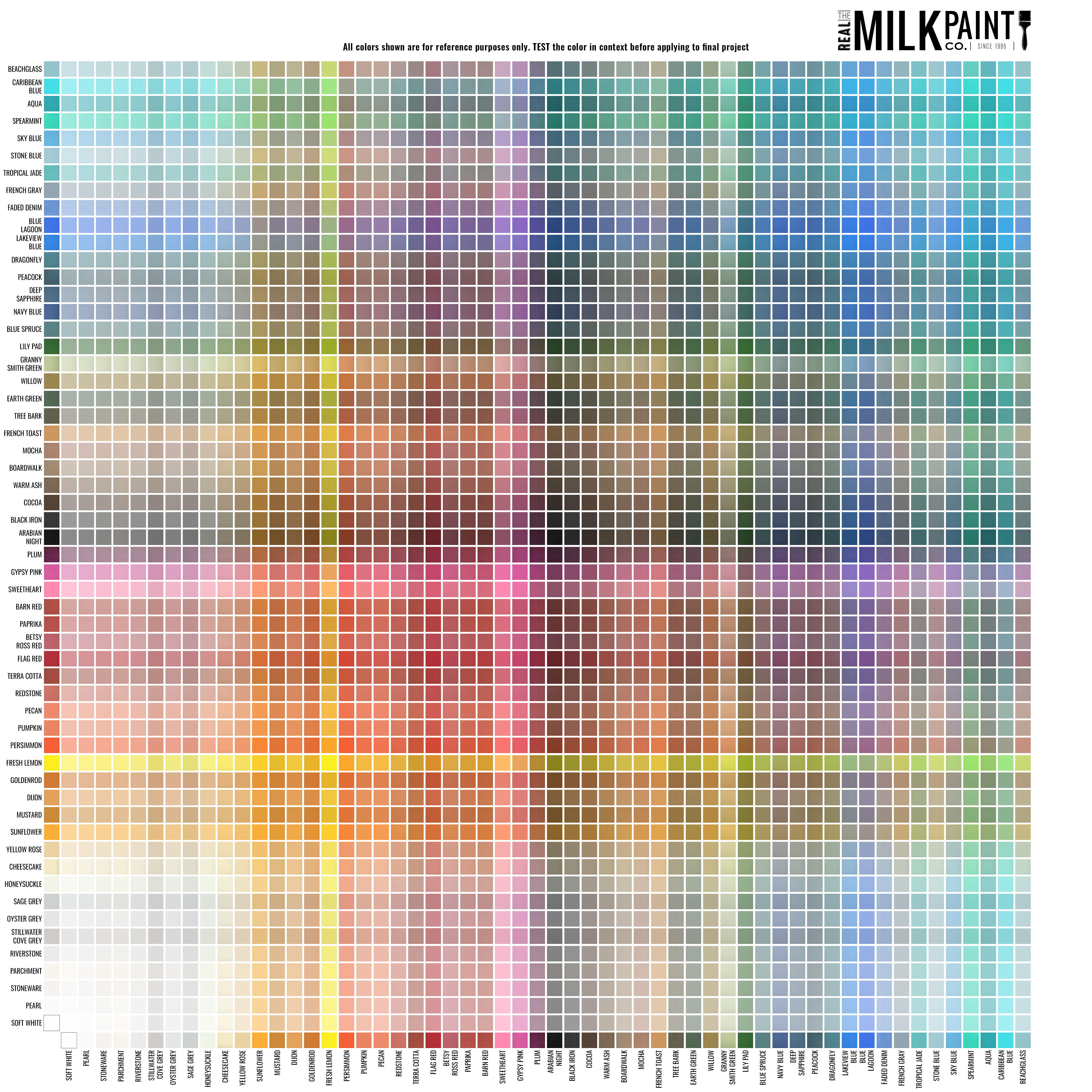
Using a Color Mixing Chart
A color mixing chart is one of the most helpful tools you can use, especially when working with powdered milk paint.
How to Read the Chart
RMP Finishes’ chart is based on 1:1 ratios to show what happens when one part of a color is mixed with one part of another. It gives a visual preview of blends before you begin mixing powders.
In the guide below, the second number refers to our Soft White color, and the first number refers to the color shown. For example, 9:1 in the first row would be 9 parts of Pearl and 1 part of Soft White.

NOTE: The color mixing chart is for reference only. Please test primary colors and secondary colors before applying them to your final project.
Why Parts Matter
The guide uses “parts” rather than fixed measurements, which means you can scale recipes up or down easily.
Example:
- 3 parts of one color
- 7 parts of Soft White
…could be 3 tablespoons to 7 tablespoons or 3 cups to 7 cups.
Practical Exercises
Try these to build confidence:
- Mix Fresh Lemon + Blue Lagoon to create your own green
- Create three tints of any color using white at 10%, 30%, and 50%
- Use black to build a monochromatic gradient from deep tone to pale tint
Advanced Techniques for Professionals
If you’re mixing colors regularly or matching historical finishes, these techniques will take your work further:
Common Mistakes in Color Mixing (and How to Fix Them)
FAQs
Final Thoughts on Color Mixing
Color mixing is one of the most rewarding parts of working with Real Milk Paint. With a little experimentation and the help of a color mixing chart, you can turn any of our 56+ milk paint colors into hundreds of custom blends—perfect for furniture, cabinetry, décor, and restoration work.
Ready to start creating?
Explore More:
Guide On How to Use Milk Paint


